
Creating a Spooky Halloween Theme for Presentation Slides
January 06, 2026

Creating a Spooky Halloween Theme for Presentation Slides
During the last PHP×Tokyo meetup, I got asked how I created my slides and while explaining the visual details, I thought it might be interesting for other web engineers too, regardless of their experience. For context, the lat meetup was just before Halloween, so I wanted to add a special Halloween-themed atmosphere that would make the slides more engaging. The result was a multi-layered, interactive Halloween theme built with Vue 3, TypeScript, and CSS animations. In this post, I'll break down how each spooky element was implemented.
Architecture Overview
The Halloween theme was composed of several overlay components that work together to create an immersive spooky atmosphere:
- SpookyOverlay: Animated spiders that crawl across the screen
- GraveyardOverlay: Creeping fog effect at the bottom
- WebsOverlay: Scattered spider webs throughout the presentation
- LightningOverlay: Random lightning flashes
- Main App: Gradient overlays, floating emojis, and decorative web corners
All overlays are positioned absolutely and use pointer-events-none to ensure they don't interfere with slide navigation or interactions.
1. Crawling Spiders (SpookyOverlay)
The most interactive element of the theme is the animated spiders that crawl across the screen. Each spider has its own randomized properties and behavior.
Spider Properties
Each spider is defined with the following properties:
type Spider = {
  id: number;
  top: number; // Vertical position (0-90%)
  left: number; // Horizontal position (0-90%)
  size: number; // Emoji size (18-34px)
  durationMs: number; // Animation duration (9-18 seconds)
  delayMs: number; // Initial delay (0-6 seconds)
  angleDeg: number; // Movement angle (0-359°)
  distancePx: number; // Crawl distance (80-160px)
};
Animation System
The spiders use a two-layer animation system:
- Linear Crawl Animation: Moves the spider back and forth along its angle
- Sway Animation: Adds a subtle bobbing motion to make movement more natural
@keyframes crawl-linear {
  0% {
    transform: translate(0, 0);
  }
  50% {
    transform: translate(var(--dist), 0);
  }
  100% {
    transform: translate(calc(var(--dist) * -1), 0);
  }
}

@keyframes sway {
  0%,
  100% {
    transform: translate(0, 0) rotate(0deg);
  }
  50% {
    transform: translate(0, -2px) rotate(-3deg);
  }
}
Dynamic Behavior
To make the spiders feel more alive, I implemented several dynamic behaviors:
Direction Changes: Every 8 seconds, spiders randomly change direction. They can either flip 180° or adjust their angle by up to 60°.
Random Pauses: Each spider independently pauses and resumes its animation at random intervals (1.8-5.2 seconds between pauses, 0.3-1.4 seconds pause duration).
Mouse Interaction: Spiders react to mouse movement! When the cursor comes within 160px of a spider, it gets "repelled" away using CSS custom properties:
const RADIUS = 160;
const MAX_REPEL = 80;
// Calculate repulsion based on distance
const strength = (1 - dist / RADIUS) * MAX_REPEL;
spider.style.setProperty("--repelX", `${nx * strength}px`);
spider.style.setProperty("--repelY", `${ny * strength}px`);
The repulsion is applied via transform in the spider's container, creating a smooth avoidance effect.
Performance Optimization
Mouse movement is throttled using requestAnimationFrame to ensure smooth performance even with multiple spiders on screen. The implementation batches mouse position updates and only processes them once per frame.
2. Creeping Fog (GraveyardOverlay)
The fog effect creates an atmospheric bottom layer using CSS gradients and animations. The fog is built from multiple radial gradients layered together to create depth:
.fog-layer {
  background: linear-gradient(
      to top,
      rgba(255, 255, 255, 0.12),
      rgba(0, 0, 0, 0) 85%
    ), radial-gradient(/* multiple radial gradients */);
  filter: blur(4px);
  animation: fogCreep 14s ease-in-out infinite alternate;
}
The fogCreep animation slowly moves the fog up and down, creating a creeping effect:
@keyframes fogCreep {
  0% {
    transform: translateY(0) translateX(0);
    opacity: 0.8;
  }
  100% {
    transform: translateY(-48px) translateX(-24px);
    opacity: 0.95;
  }
}
The blur filter and semi-transparent white gradients create a realistic fog appearance that doesn't obstruct content.
3. Spider Webs (WebsOverlay)
Spider webs are scattered across the presentation using SVG-based web graphics. Each web is randomly positioned, sized, and rotated:
type WebSpec = {
  id: number;
  topPct: number; // 0-85%
  leftPct: number; // 0-85%
  sizePx: number; // 90-220px
  rotateDeg: number; // 0-360°
  opacity: number; // 0.08-0.22
};
The webs are rendered as inline SVG data URIs, which means no external image files are needed. The SVG includes:
- Concentric rings (circles at increasing radii)
- Radial spokes (lines from center to edge)
- Ring connectors (arcs connecting the rings)
The webs use mix-blend-mode: screen to create a glowing effect against the dark background, and a subtle drop shadow adds depth.
4. Lightning Flashes (LightningOverlay)
Lightning flashes occur randomly every 3-12 seconds to add dramatic effect. The implementation uses reactive state to control flash intensity:
const isFlashing = ref(false);
const flashIntensity = ref(0);
When triggered, the flash:
- Sets intensity to 1 (full brightness)
- Maintains the flash for 50-150ms
- Fades out over 50ms
- Schedules the next flash
The visual effect uses multiple gradient layers:
- A linear gradient across the entire screen
- A radial gradient positioned randomly to simulate the lightning source
- Both use white with varying opacity based on
flashIntensity
The random positioning of the radial gradient on each flash creates variety in the lightning effect.
5. Atmospheric Overlays
The main application component adds several atmospheric layers:
Typography
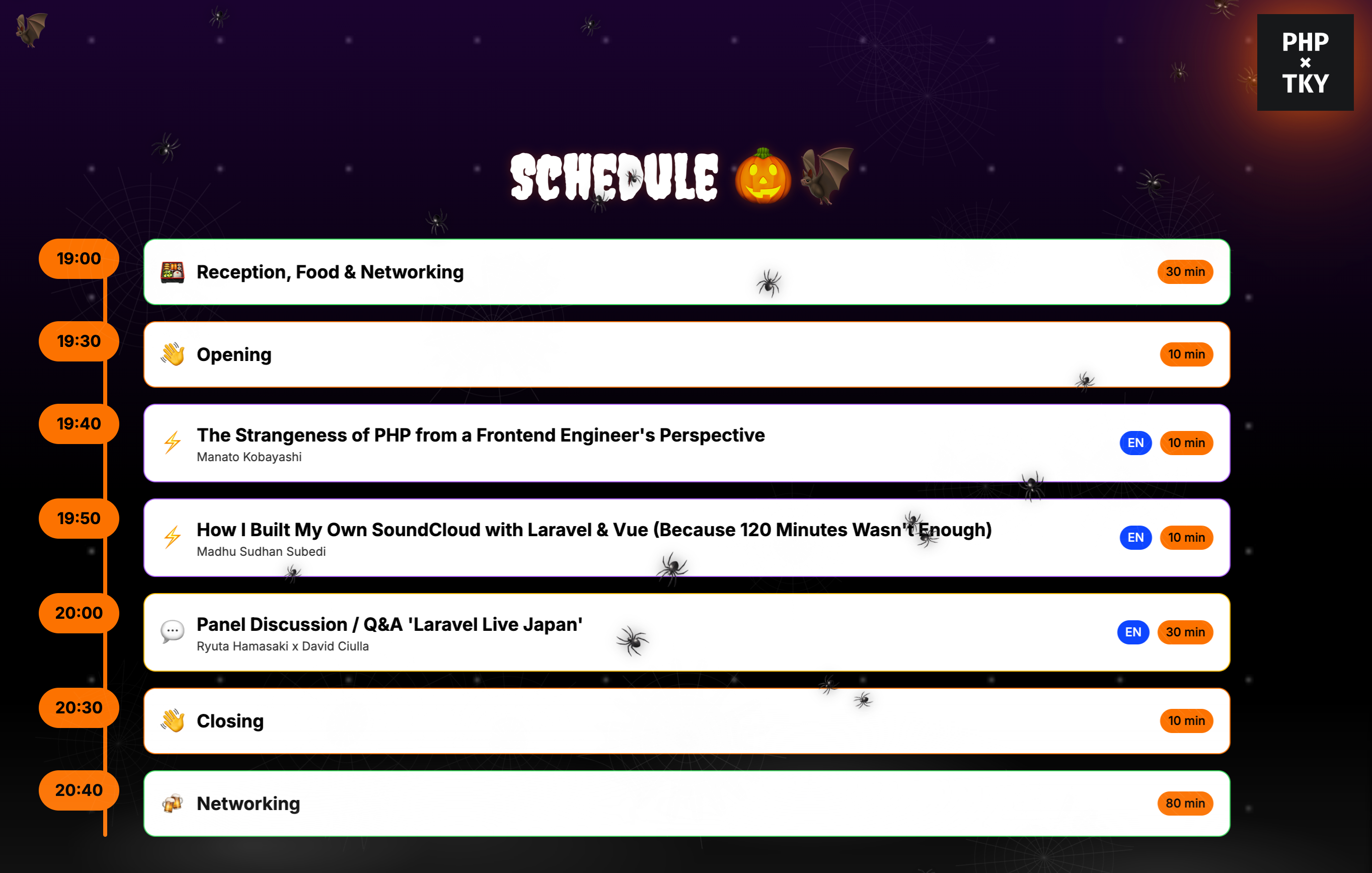
To enhance the spooky atmosphere, the Creepster font from Google Fonts was used for headings and titles. This decorative font with its bubbly, slightly irregular letterforms perfectly complemented the Halloween theme and added character to key text elements like the "SCHEDULE" title.
Gradient Overlays
Two gradient overlays create the spooky color scheme:
- Purple-to-Black Gradient: A vertical gradient from purple-900 to black with 40-70% opacity
- Orange Radial Gradient: A large radial gradient with orange tones (rgba(249,115,22,0.14)) using
mix-blend-screenfor a warm glow
Floating Emojis
Three floating emojis (🦇, 🎃, 🕷️) are positioned at different locations with custom float animations:
@keyframes float1 {
  0%,
  100% {
    transform: translateY(0);
    opacity: 0.9;
  }
  50% {
    transform: translateY(-12px);
    opacity: 1;
  }
}
Each emoji has a slightly different animation duration (6s, 7s, 8s) to create varied movement patterns.
Web Corners
Decorative spider web corners are positioned at the top-left and top-right using inline SVG data URIs. The right corner is rotated 90° to create symmetry.
Dynamic Spider Count
The spider count adapts based on the current slide. For the intro and feedback slides, 16 spiders are shown instead of the default 10, creating a more intense spooky atmosphere for key moments.
<SpookyOverlay
  :count="
    currentSlideName === 'intro' || currentSlideName === 'feedback' ? 16 : 10
  "
  class="z-30"
/>
Z-Index Layering
Proper z-index management ensures all elements render in the correct order:
- Background gradients: Default (z-0)
- GraveyardOverlay (fog): z-15
- WebsOverlay: z-20
- SpookyOverlay (spiders): z-30
- LightningOverlay: z-25
- Slide content: Above all overlays
Performance Considerations
Several optimizations ensure smooth performance:
- CSS Animations: All animations use CSS transforms and opacity, which are GPU-accelerated
- RequestAnimationFrame: Mouse interactions are throttled to frame rate
- Scoped Styles: Component styles are scoped to prevent conflicts
- Pointer Events: All overlays use
pointer-events-noneto avoid blocking interactions - Cleanup: All timers and event listeners are properly cleaned up on component unmount
Conclusion
By combining multiple overlay components with carefully tuned animations and interactions, the theme added personality and interactions to the slides.
The modular component architecture makes it easy to:
- Adjust the intensity of effects
- Enable/disable specific overlays
- Customize behavior per slide
- Maintain and extend the theme
All effects are purely visual and didn't interfere with the core presentation functionality, making this a perfect example of progressive enhancement in a Vue.js application.